


Have you ever stepped into a room and instantly felt a sense of calm? This phenomenon isn’t just a coincidence or a unique feeling you have. In fact, color can significantly influence your perception and emotional response to a space.
You may recall learning about the color wheel in elementary school, where we discovered the categories of Cool Tones, Warm Tones, and Neutrals. This concept applies to the colors in a room as well. Each color has a distinct effect on the atmosphere and emotional vibe of a space. Warmer colors, for example, tend to make people feel more relaxed. This is why many people prefer warm-tone light bulbs vs cool-tone ones — they create a more soothing and comfortable environment. The warmth of light is often associated with cozy moments, like a fire or a sunset, while cooler light feels more sterile, resembling environments like hospitals.
But how does color perception tie into this? Just as lighting influences the figurative warmth of a room, wall colors can directly affect your spatial awareness and emotions. Understanding the impact of different colors can open your eyes to the subconscious feelings they evoke.
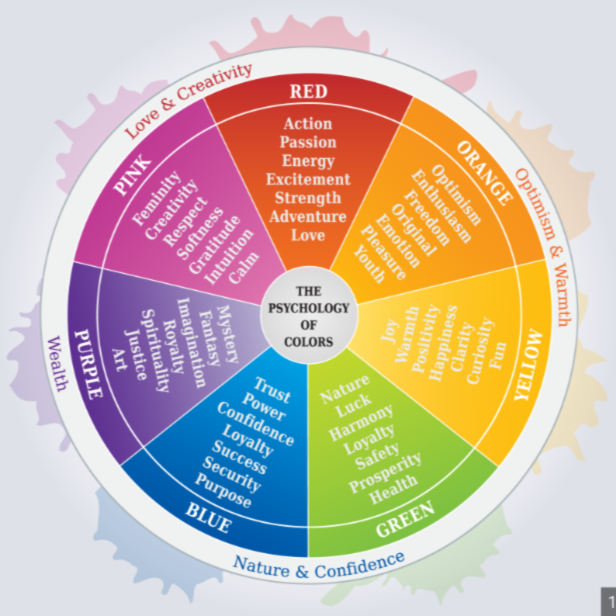
Red is a bold and intense color. It can evoke a sense of romance, love, and intimacy, making it ideal for creating a more personal or cozy atmosphere. A muted or pastel red can spark feelings of passion, while a bright red can feel overwhelming, sometimes leading to feelings of anger or frustration. A combination of both bright and muted reds can convey power and confidence.
Bright orange can inject a burst of energy into a room, making it feel lively and dynamic. However, more muted or brownish oranges can have the opposite effect, making the room feel dry, depressing, or even dated. Terracotta shades, for example, might make a room seem older than it is.
Pastel yellow, like the soft tone of banana yellow, can create a calming, cozy atmosphere in a room. In contrast, bright yellow is often uncomfortable and overwhelming, potentially increasing feelings of anxiety or even danger. However, yellow accents can add elegance and a sense of richness to a room without being too overpowering.
Light pastel green can bring a fresh, calming vibe to a space, reminiscent of nature. Darker greens, like forest green, can add a sense of richness and elegance but may also make a room feel smaller and more isolated, evoking a sense of loneliness despite the luxurious atmosphere.
Pastel blue is associated with childhood and youth, evoking positive, calm feelings. This is likely because blue has historically been used in nurseries and baby rooms. Even darker shades of blue are often linked to relaxation and tranquility, making blue a popular choice for bedrooms or spaces meant to promote rest.
Light pastel purple is often tied to creativity, inspiration, and serenity. It has a calming, almost innocent feel. On the other hand, bright purple can be intense, adding a rich and dramatic touch to a room, though it may sometimes feel a little too bold.
Grey is a versatile, neutral color that many people view as timeless. However, it’s also known for being one of the most depressing colors to have in a home. The reason is simple: after a day filled with bright colors and vibrant surroundings, stepping into a room dominated by grey can feel dreary and emotionally draining.
White is often considered the perfect “blank canvas” for design, providing a fresh and open atmosphere. While it can make a room appear larger due to its ability to reflect light, it can also feel suffocating and sterile. It lacks the warmth or personality that other colors can offer.
Black, though rarely used in large quantities, can dramatically affect a room’s mood. It absorbs light, leaving little contrast or dynamic play between the walls and the furniture. While some may find it sleek and modern, it’s more likely to evoke feelings of sadness or darkness, as it can create an overly somber atmosphere.
Understanding the psychology of color can help you choose the right hues for rooms in your home, whether it’s the bedroom, kitchen, or living area. The more you pay attention to color and its effects, the more aware you’ll become of how it influences your mood and feelings.